Digital Design Case Study: Ugandan NGO
On helping low resource organizations accomplish development work.
Introduction
Keep Alive Missionary Ministries is a Ugandan non-governmental organization the focuses on educational means to alleviate poverty. As an intern with The Non Profit Help International, I was to help them with their website and marketing.
The Problem
The main problem was lack of capital. They don’t bring in much when it comes to donations and all their workers are volunteers. It is also difficult to gain funding in Uganda because of how bad the economy is. They also didn’t have much exposure online as with most NGO’s over there and their Facebook page doesn’t reach potential donors/partners. If they are to succeed the website needs to be a platform that shows they are a legitimate organization for western aid. They also need ways to make more contacts with western non-profits.
Ideating
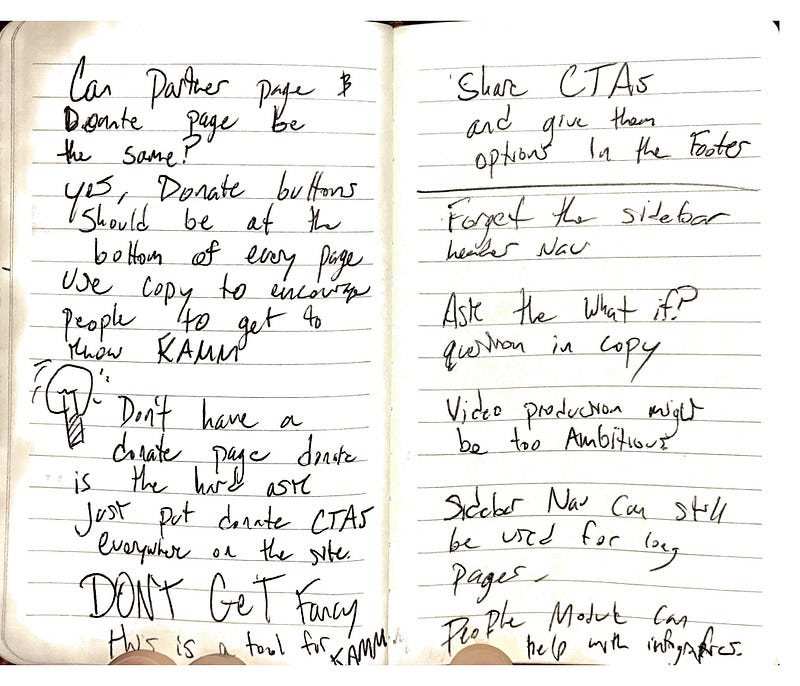
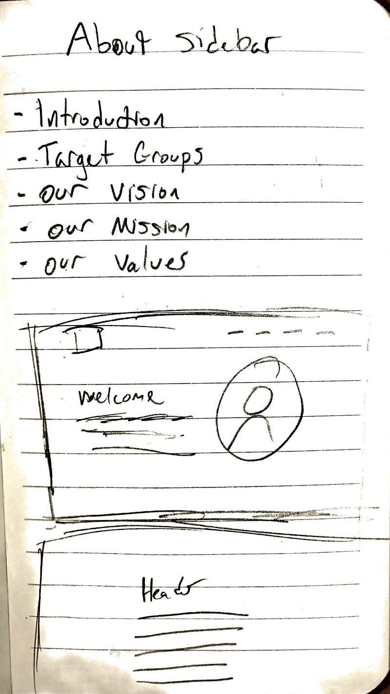
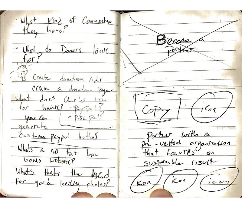
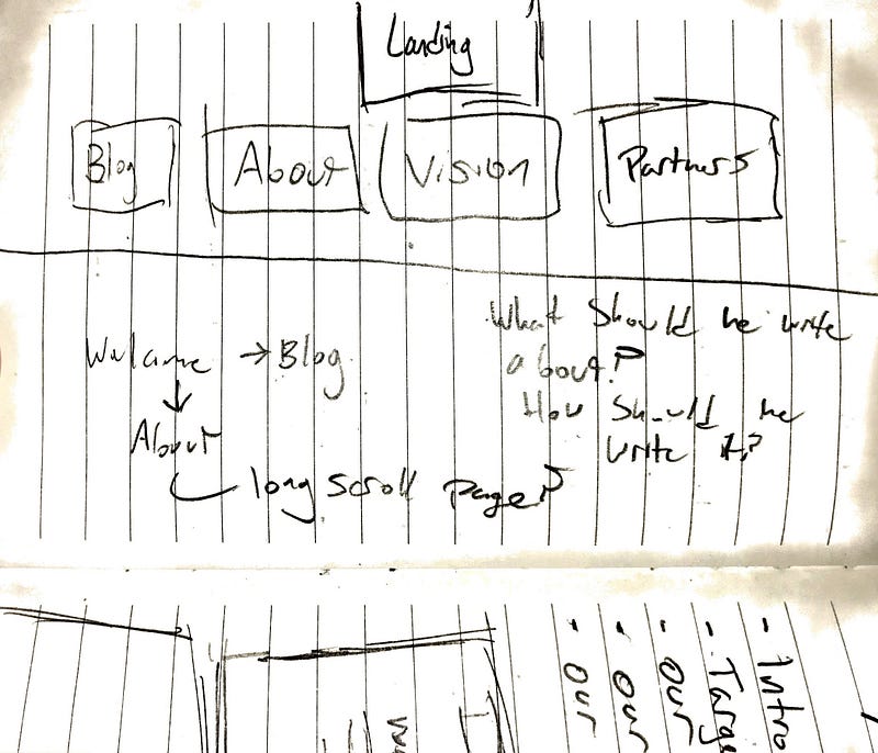
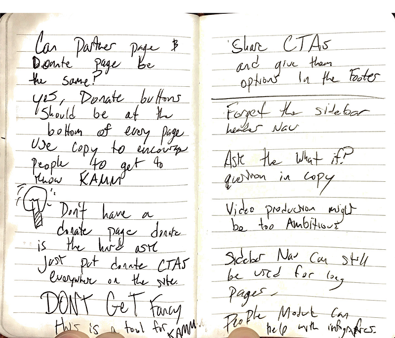
I sketch up ideas on a light website with a vertical navigation with light photos. The assumption behind that was it needed to load on slow internet. I then changed directions since I drew these sketches because the target audience (ie westerners) usually have better internet connections and thus can handle more robust presentations.
Copywriting
I then worked with a small group of volunteers to write the copy for the website. I wrote most of the splash page copy based off information the director of KAMM gave me and research I did online. After it was finished I had it edited by another intern who minored in editing. The director, Charles, also sent us his life story for his about page, and an english intern converted it into a biography.
Designing
I photographed and edited most of the assets for the site and used rights free images for some historical photos. I designed in XD and experimented with some color palettes that helped the flow of the presentation. For example: on the splash page, the orange to red gradient was to change the mood as the history of Uganda got bloodier and darker. The bubble images let me use more color, the reasoning behind this is that the images when they are square limit me on how I can lay out the presentation. I feel that with rounder images I am able to have more flexibility on layout and alignment which is the case on this website. I also redesigned the logo to look cleaner and more modern as well.
The Final Product
The site can be found at keepugandaalive.org. This project was extremely fulfilling. The big challenge, however, was finding a secure way for them to receive payments. Uganda cannot have a merchant Paypal account so we are still figuring out that issue. For now, you can just contact them and wire money over if you are interested. The big takeaway here was aggregate all assets before designing and building. I say this because we had delays in acquiring the web hosting to build the site. This gave me time to work on preparing images and other assets I would then use on the site. When everything was ready and organized, I could properly design them in Sketch or XD to get the full picture on what I wanted. By doing this build time was a fraction of what it usually was.
I left behind an SD card with over an hour in video tutorials I made on how to use the site, how to market his NGO on social media, how to network for partnerships on social, and how to maintain an online publication.
I still keep in contact with Charles and help any way I can and try to help him with questions he has or fix any problems with the site remotely. Soon after arriving home from Uganda I also helped him set up an email newsletter and taught him how to use it so he can start building an email list.
Results
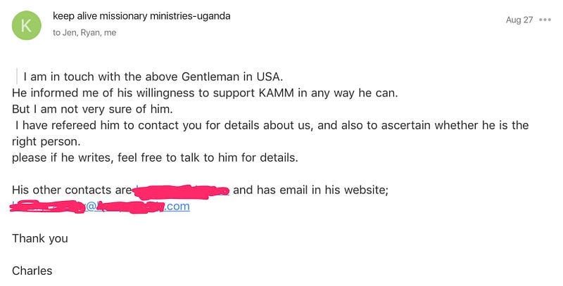
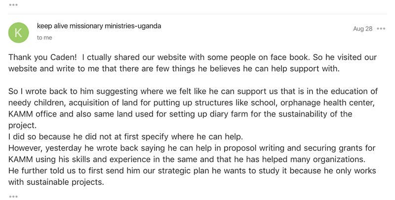
Charles just recently let me know over a month after getting home that he has been sharing the website on non-profit Facebook pages and just made a connection with a man who acquires grants for development projects!
Attached are some screenshots of our email corraspondance and an email from the gentlman that wants to help.
Originally published at CadenD Studios.


