Figuring out Slack
An evaluation of Slacks on boarding process
An evaluation of Slacks on boarding process
I’m a part of several teams on Slack, and I love it.
Maybe I will write this in another blog post but I still have yet to understand what makes this messenger platform different from others, and what makes it so great for work projects? I’m able to shoot off quick, work related messages as inspiration strikes, and having a record of my conversations in certain contexts like one-on-ones with certain individuals, or virtual team meetings. The ability to upload project files to the service is nifty as well, which you can’t do with your average messenger app.
Today I want to share a more intentional look of me joining a team for one of my University classes. I approach it as if I have never used Slack.
It starts off as a simple email invitation, with a form and a checkbox asking if they can send promotional material to you, pretty simple and straightforward.
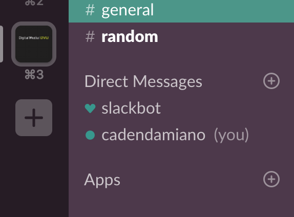
So from there it automatically takes me to the browser app of Slack. Which is great, but I want it on my desktop. So I open up my desktop app and press the “add” button.
Following that action, which is obviously a button to add more channels, the Slack team enter me here:
It is interesting that I am not dropped off at a normal login page. I don’t need to remember my username or password, I simply need to enter the slack URL.
In my opinion, this is a great idea because if I where a new user, I wouldn’t have the pre-established habit of entering in my URL. So entering in the name of the channel I want is a good start.
I then went to a screen that asked me to enter in my email, I’m assuming to authenticate that I belong to that team.
Then I’m giving this option:
You mean I don’t have to memorize a password?
Slack has reduced so much cognitive load it’s insane.
Imagine if you had to remember all your teams passwords? What about this question: How many people would even use Slack if there wasn’t this one feature?
Magic Indeed
The magic behind Slacks on boarding process has to do with the design principles of Affordance and Forgiveness.
Affordance are the clues of how an object should be used, an example of Slacks simple “add a new channel button” which has a big “plus” sign on it comes off clearly because it rests under all of your current channels. Slack leaves plenty of hints on how to navigate the app, at least in the case of on boarding.
Forgiveness is the design principle of allowing the user to recover from error or even prevent error altogether in Slacks case. Instead of giving us the dreaded option to reset our password, they give the option to to just send us a quick email to login. By sidestepping the possibility of forgetting password itself, Slack has made their log in process buttery smooth, making it so people will continue to add as many teams as their heart desires.
When it comes to designing a product, maybe a thing to consider is designing it to prevent error in the first place. Make it super usable with clear clues how to use the product and take out any possibilities of human error, like a magic email link!


