How to Use Design Principles to Calm Yourself Down
Ever hear of the excuse that geniuses are known to be unorganized?
That excuse has been used by so many unorganized people that it makes me question if the word ‘genius’ means anything anymore.
Stress may come from many things outside of our control but the things that are can be managed and organized. The same thing goes for product design and lifestyle design. In this article I want to talk about 4 design principles we can use to lower stress in our products and in our own lives.
Nudge
Definition: A method for predictably altering behavior without restricting options or significantly changing incentives.
Nudging is giving people all the choices but using design to influence the decision.
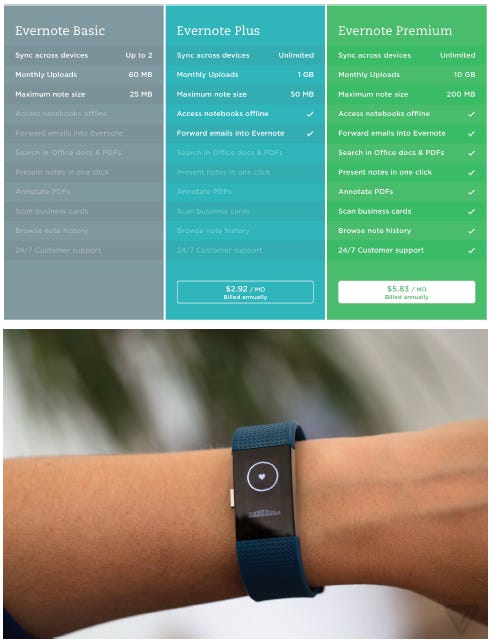
Every time Evernote wants me to upgrade, the premium option always looks the best. Because, green means good, it has all the check marks, and I feel like a chump for taking the less sexy option in the middle. I have all the choices here, but it is gray and drab to be a free user. Which is probably why I will eventually upgrade, once the student plan site starts working again.
On my Fitbit, there is a deep breathing feature where it guides your breathing with a vibration. The feedback you get when you breath correctly is little-pixelated sparkles on the screen. I don’t know why, but I feel accomplished when I get those sparkles, so I try to match my breathing with the vibrations and as a result, I calm down. Nudge can be used to take the users mind off their worries. Who says manipulation is bad?
Nudge can be used to make us feel better about getting up early for the gym. A good example is having all your gym clothing ready to go on a chair or nightstands so you can jump out of bed and get dressed.
Progressive Disclosure
Definition: To effectively move complex and less frequently used options out of the main user interface and into secondary screens or information spaces, and in order to make more information available within reach; being careful to not overwhelm a user with “all” the features and possibilities.
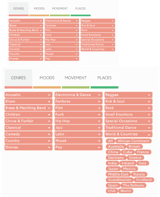
The above example comes from Epidemic Sound. It is how I get my royalty free tunes for video production. When sorting through mounds of music, Epidemic Sound uses progressive disclosure in the form of a drop down menus the user can click through to sort through songs by things like timbre, genre, and BPM’s.
I’m thoroughly convinced something isn’t power user friendly without drop-down menus. if you don’t have a specific idea what you want, you can just click the root of the drop down to see all the songs in that folder. But the power user is clicking though all those drop down menus to find the right sound for their video. It helps the ego if you know where to dig.
Or think of the success of Turbotax, they make taxes easy because they progressively disclose your tax return so you arn’t overwhelmed by the size of the ordeal.
Progressive Disclosure can by utilized in your personal life as well, think of how you schedule your work in a calendar app, get small winnable tasks done at the start of the day to get some confidence, then progress to the bigger tasks when momentum is built.
Similarity
Definition: Elements that are similar are perceived to be more related than elements that dissimilar.
My mother is an interior designer, and in the world of interior design, what carries a room is the principle of similarity. In the above examples, the top group of pillows looks good because they are similar makes. Similar fabrics make a living setup flow.
In contrast, if you threw one of the “love” pillows with above Nordic style, it would look out of place. My mom would always judge how I chose my clothing as a teenager because I would wear a nice dress shirt with cargo pants. Great styles (well maybe not the cargo pants) but they are not similar styles, so it looked strange.
In digital product design, making sure all assets fit the same look and feel will help the user go through your product without being hung up on the differences that otherwise would have been there.
Wayfinding
Definition: The process of using the spatial and environmental information to navigate to a destination.
Wayfinding helps the user orient themselves to get to their desired destination. it orients people so they can more easily find their way. Mazes are the opposite, they are designed to not help you orient yourself. Its good for entertainment, but if people are pressed for time, I wouldn’t recommend you make your products a maze.
In this example of signage used in a stairwell of a media company’s building. It helps you orient yourself to what floor you are on, what that floor is used for, and you can use that info to compare with your desired destination. Ikea does this too in their stores, it’s like a maze video game with all the cheat codes.
In many examples of Wayfinding design, it is to assure the user they are in the right place, and if you can help them feel that way when they are on your site, like a sales page, you will convert more.
In the personal life, you can use Wayfinding to help you organize. In my moleskin, I make sure to draw think headings to my notes so I can easily reference captured ideas at a future time.
Thanks for reading!
Originally published at CadenD Studios.


