Stop Using “Scroll Here” and “Tap Here” UI Prompts
This article is going to focus on the gimmicks. These are interactions that limit what the reader can experience because of a lack of creativity on the part of our industry as a whole.
The tools we use to create digital publications are limited, most of them are plug-ins to print design tools–meaning that the best tools for rapidly assembling rich media content might not be developed yet.
The biggest limitation of the digital publishing landscape is turnover time. To shorten that time, you need to hire more designers, which costs more money, which lowers profitability because there isn’t a mass market for this kind of content yet.
So many magazines who try to use the current tools of the trade transition to basic mass pdf distribution and forgo rich media, to save money and not bother with a cool idea.
This article purpose is to look for opportunity. This is an audit of lazy UX and amazing steps in the right direction.
Because the is money to be made because of mass market adoption of tablet technology. There is just the challenge of figuring out the interactions.
Hilton Club Traveler Magazine
This example I want to talk about the “scroll for more” prompt. I’m not saying it is bad, but it sure isn’t creative.
What makes a magazine experience or a print experience work period is the ability to have natural wayfinding. This is when you can look at the thickness of the document let you know how much further you needed to go, and uncompleted sentences where marked by an ellipse (…) that indicated to the reader that the dialogue continued on the second page.
One thing to consider as an interaction designer is if we want to remind the reader that they are still on an iPad?
Things like, “tap here” or “scroll down” are friction points that prevent you from really getting lost in the experience.
United Airlines “Hemispheres” Magazine
This example shows a good leading illustration that prompts the reader to scroll down. There is the added affordance that a downward arrow to those who wouldn’t intuitively scroll, but the illustration cuts off and makes me want to scroll down.
What if the content looked incomplete all the time? Instead of having all the images visible, why not have them go off screen a little to prompt the reader to scroll in the direction of the inconsistency?
Humans are wired to closed loops, that’s why murder mysteries and other binge watchable TV shows are multi-billion dollar industries.
UNOG Annual Report
This is another example of how uncompelling a “swipe up” prompt is.
Unfortunately, if it wasn’t there, in this case, the reader probably wouldn’t have read on.
It might have been better to just lead a truncated paragraph in the place of the prompt to allow the reader to close the loop themselves. Or half a picture that guided them down the page.
MAD Magazine
I think this is good UI. Like I was saying before, leaving an incompleteness to allow the reader to explore and find out for themselves whats on the other part of the spread.
The “R” on the right side of the page is truncated, with a blue line stemming from the “Spy vs Spy” cover page. This says to me that I need to scroll left to see more, and when I get started, I’ll keep scrolling until I see everything.
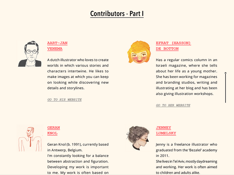
Scrawl Magazine
The contributor’s page in Scrawl magazine applies the open loop principle with an arrow affordance for those who still don’t see that there are incomplete sentences.
Layout and presentation should prompt the user to explore, not tell the reader what he or she should do.
“Scroll here” or “tap here” is retrofitting the print experience to accommodate the digital experience.
The big take away from this audit is the fact that we can’t pay homage to print experiences anymore.
If we want people to consume content with less friction, tablet experiences should accommodate open loop content that needs to be explored or at least prompt the direction the reader should explore.
Thank you for reading this short article of mine. You can download the full pdf of my digital publishing UI audit here.
Originally published at CadenD Studios.


