The Willy Wonka of Color Websites: A Design Audit of Color Claim
Color Claim is a resource by Tobias Van Schneider. I discovered him on medium and the guy has a great track record. (Working at Spotify, having Redbull as a client, etc. )
It is his gift to the design world to seek color inspiration and download color palettes from one of the worlds most accomplished product designers.
The following is a critique of the website, what improvements could be possibly implemented, and selfishly get some color ideas while doing a project.
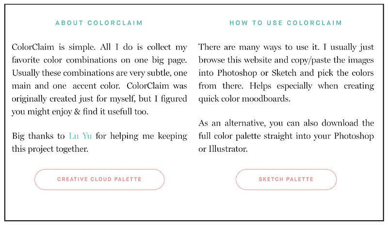
What is ColorClaim?
ColorClaim is a one-page scroller website designed by Tobias Van Schneider. An Austrian Designer who once was a lead designer for Spotify in New York.
He was responsible for standardizing Spotify’s design system to consist of what is now the current applications.
This website is his library he curated to find color inspiration and keep track of the cool colors he has found in his career.
Audience
In Color Claim, the Audience is geared toward digital product designers. It is intended to be a library for color inspiration and a way Van Schneider, much like with sharing music, shares his opinions on color theory.
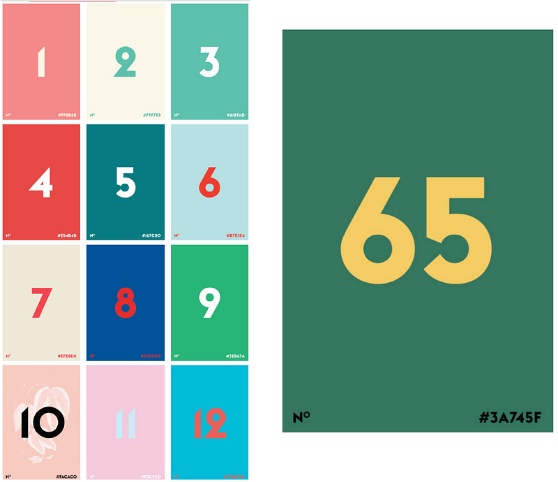
The entire document is just a bunch of color tiles paired with potential color combos. So whenever a designer needs some color inspiration, they can shuffle through these colors.
The fact that you can download the entire palette onto either your Creative Cloud libraries and your Sketch program shows that it is for product designers as well. I just bought Sketch, but I have Color Claim downloaded in all my Creative Cloud apps, so if I like a color I can pull it up in XD, Illustrator, and Photoshop on demand.
Design
After the introduction section, the color tiles are arranged in a 3 column grid that if a responsive layout that works on a mobile device as well as the phone the phone. The color he chooses are amazing, and they avoid any basic color wheel colors. It is set up to be an all you can eat buffet of color inspiration. I love it for that reason, it’s a one-stop shop of proven color palettes. My only qualm with the design is the typography used for the hexadecimal values. Sometimes I mix up the zeros and the O’s and it takes me a couple trying to type in the color I want because you can copy and paste the type on these images. If there was a way to highlight to copy and paste that would be nice. But since it in the creative cloud library, it isn’t too inconvenient.
Content Inventory
When you finally scroll down to the bottom of the page there are calls to action to check out the portfolio software that he sells and the blog he runs. Many content marketing strategies include blog posts and videos, this is the first time I saw value added through the use of color palettes. The structure of the website is to gain re-peat visitors. So they are always in some kind of contact with Tobias Van Schneider. The cool part is that he doesn’t have to do a lot of work to maintain it. That is a lot less work than a consistent content marketing. Which he does, as you can see by the Newsletter opt-in. This is probably why he gets so many high ticket clients for his design shop.
Conclusion
Color Claim is a solid resource that is super friendly to use besides the font used for the Hex Color. What makes this site so “sticky” for me is the fact it makes me feel like a designer. And if I like a color I can just screenshot a few tiles I like and compare them in Sketch of XD, or even better: have the option to sync to my Adobe CC account or upload it into Sketch.
It is also a great idea for content marketing. If you make it as a designer, having a library of assets open to the public is a good way for budding designers to see what goes on in the mind of their design role model.
The repeat visitor value is huge and easy to maintain. It makes me want to start collecting colors for my site.
Originally published at CadenD Studios.


