Use Design To Keep Students From Falling Asleep
Boredom is a Symptom
I think the education system is making large strides lately, as technology gets better (and as long as capitalism is still a thing) entrepreneurs are going to create solutions to some of the biggest problems in education. Students all learn differently, and teachers aren’t paid enough. Truth is teaching is difficult and has a lot of skills that can be automated. Teachers need to spend more time answering questions, and technology can allow for easier consumption of content. In this article, I’m going to explain 4 design principles you can implement into a product that make it easier for teachers to help more students.
Chunking
Definition: A technique of combining many units of information into a limited number of units or chunks, so that the information is easier to process and remember.
Chunking claims that humans can only process patterns based on partitions between 3–5. Anything above that we start to have information overload. That’s why hyphens are used to spread out important numbers like your social security and phone numbers. Hyphens are the manifestation of the chunking principle. Use this if you need info to be remembered by the user/customer. I simple example is using chunking on a business web page to highlight a sales phone number. Like this one from WP-Engines support page. I also like how they used a different color as well.
Depth of Processing
Definition: A phenomenon of memory in which information that is analyzed deeply is better recalled than information that is analyzed superficially.
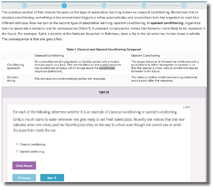
The depth of processing principle applies to the how information is designed to have the users process and reprocess information so they better retain what they are learning. The more touch points they have with a concept allows them to remember something more. In branding, it takes about 7 interactions for a person to become a user/customer of a brand. If you see something around enough you will remember it.
In this example, I screenshot my Psychology homework. It is awesome because it automates deep processing with multimedia presentations of the same idea to create connections and retouches with a concept across modules. This is a big trend in computer-assisted learning. Making deep processing automated.
Text, images quizzes, and videos.
Readability
Definition: The degree to which prose can be understood, based on the complexity of words and sentences.
When I think of readability the first thing that comes to mind is high converting sales copy for e-commerce stores. In the digital marketing space, sales copy that is easy to read is conversational, and the words covey benefit rich results usually make the most money. As long as the actual product is good too. This example shows very readable points of the benefits of an electric longboard product.
When thinking of the target audience of a digital experience. The prose needs to match their reading level. If it is the academic community, dry complex language has other academics taking you seriously.
Signal-to-Noise Ratio
Definition: The ratio of relevant to irrelevant information in a display. The highest possible signal-to-noise ratio is desirable in design.
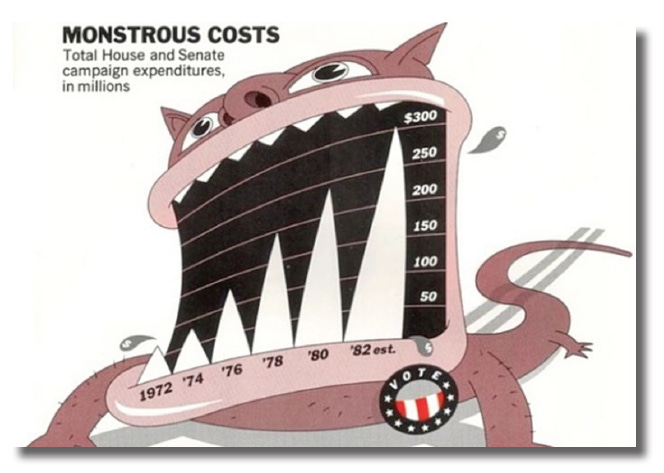
In infographics, the data to ink ratio has to do with the amount of ink used for a data representation to convey relevant information. Any ink used past the minimum required amount to make a point is irrelevant. As it is in design, the minimum amount of effort to elicit the desired response is preferable.
Anything more doesn’t really push the needle. A good example is chart junk in data visualization. So much noise in this example distracts from the actual information and makes it less readable.
To maintain your sanity as a designer and save hours of work it would be wise to make the ratio as high as possible and focus on the most impactful aspects of a design and avoid trying to make it look pretty by adding unnecessary embellishments.
Thanks for reading!
Originally published at CadenD Studios.


