Pt 3 on Digital Publishing and UX
The Introduction.
It is all about intention.
What do you want to accomplish with a purposed digital product? Do you really need an app? Does it really need to exist? Can you accomplish the same goal with an HTML interaction?
For example, if you have a long form fiction book that can be consumed anywhere, you can opt for an audiobook designed to be binged.
If you have a non fiction book that is designed to be referenced to, you can go by way of ePub.
So what would the intention be behind an iBook?
My first interaction with the iBook format was a biology textbook I needed for a general education requirement.
It made for a cool experience because all the content was tap-able and you could interact with what you were reading in a meaningful way.
This is different from an ePub layout which in a way is all the text of a book in the digital format. An iBook experience is native to the iPad platform. In some ways, you can’t jam in an entire book into the scrollable iBook format unless it is like the textbook above. iBooks work better for education because the format allows for visual storytelling, and it isn’t meant to fit a coherent narrative that long form content usually requires because like the textbook, it becomes too dense. Thats fine for a reference book, but how many people actually consume the whole fiction book in this format?
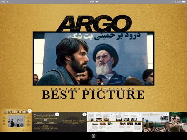
During Oscar season, some movies will make “for your consideration” packages that highlight the the powerful storytelling of a film. For example, the film Argo, which won best picture in 2013, made this interactive E-Book with the sole purpose of convincing the “academy” that they made a good movie.

The purpose isn’t cover the whole narrative, it is to convey how cool the story is — and that is exactly what I am going to do with my running “Hero of the Empire!” Immersive Publishing project!
The Project.
I’m creating a iBook experience highlighting the true story of Winston Churchill chronicled in Candice Millards “Hero of the Empire”. I have already ready made an audiobook that covers the whole story, and I have made an ePub that gives more context to the reading experience. Now I’m creating a “for your consideration” booklet to preview at a high level this incredible true story. A ‘for your consideration to read” booklet as you will.
The Approach.
I took inspiration from the Argo booklet and decided to create the visuals based off the “Young Winston” film.

The idea is that the booklet will cover key events in Churchills life that led to his first seat in parliament. It is the “Making of Winston Churchill” in essence. If you think this booklet is cool, you should read the book!
The Nitty Gritty.
I relied heavily on feedback from other designers on the first iterations of this eBook design. I put together the original screens based off the original sketches first then I would run it by humans.
The big suggestions for the first iteration was creating a blurred background with key characters in focus.
I built that, and went through another design critique.
On some screens, the blur effect did a great job, but on other screens there wasn’t much intention behind the blur. So we decided that adding drawings and diagrams to back some of the screens would give better context behind what was going on at that part of the story.
The Build.

Enter iBooks Author.
It is far from perfect. But it is free and that gives it’s quirks a pass.
The trick to getting a good looking layout is not to do your designing in iBooks Author.

Think of iBooks author instead as a place where you organize your assets. Similar to Sketch, it is meant to refine ideas, but you shouldn’t go there to create assets unless you are some kind of wizard with the pen tool.
I’d make all the art boards you need in Illustrator at 2048px x 1496px and design around that size. Then export the art boards and watch as they practically ‘click’ into place in iBooks Author.
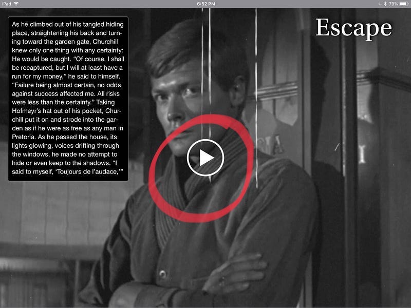
After that, any widgets can be organized on top of that. This screenshot shows the play button that I had to source because when you tell a video to play full screen on tap it does not show a play button. This play button is not part of the player widget.

The Test.
The best way test an iBook is to do it on the device (or devices) it will be used on. The iBook is meant for iPads so it saves us the work of dealing with phones or desktop devices.
The testing went smooth after a couple iterations. I’d test it usability wise and then I would run it by users and other designers to tweak and refine the designs.
The Conclusion.
The last page of the iBook I made sure to plug the book. iBooks can be seen as an awesome sales tool if your audience used iPads. You could sell a movie, book or service. New Line Cinema made a Lord of the Rings fan book that made them a lot of money (with free software). So iBooks can also be part of a ecosystem of a fan memorabilia.
To close, the trick of designing in the digital publishing space is the intention behind the message. In the heyday of broadcast journalism, the famous saying was the medium is the message because the big media corporations could control how the message was consumed. But now, because of the abundance of mediums and ways to get a message across, that is no longer the case.
The message is no longer the medium.
So as a designer, you have to creatively create a message independent of the medium. The desired effect will be the driving force, and your job is to reverse engineer the best way to get there.


