4 Design Principles that Make Me Want to Use Software Every Day
Intro
We all have software we use on a daily basis. Sometimes it is because we have to. *cough* Microsoft Word. But most of the time, we chose our applications. I have always wondered why.
In this post, I’m going to explain why I use software using design principles.
Hicks Law
Definition: The time it takes to make a decision increases as the number of alternatives increases.
In Hicks Law, it states that users will think less about how to use your product if you offer fewer choices. In the above example, we see the interface for Adobe’s experience design. It only gives you a small handful of tools to chose from when designing artboards.
In Illustrator, there are so many sidebar options that you have to be a power user to understand the program. XD, on the other hand, is very approachable and intuitive when you go to design something. I prefer it of Sketch because of this.
There also is only one window for designing and one window for prototyping. In the prototype window, the user is only given one tool. Hicks Law is definitely in play here because the power user options are not readily available.
Consistency
Definition: The usability of a system is improved when similar parts are expressed in similar ways
Spotify has a great story of when their a former lead designer Tobias Van Schneider first started to work on the design team. He said there was a common style guide and products looked different across devices.
The above images are a result of their work to create consistency across their product offerings. Navigation is similar on iOS and intuitive with the desktop app. This can be directly tied to a jump in their revenue over that last few years.
Flexibility-Usability Trade-off
Definition: As the flexibility of a system increase, the usability of a system decreases.
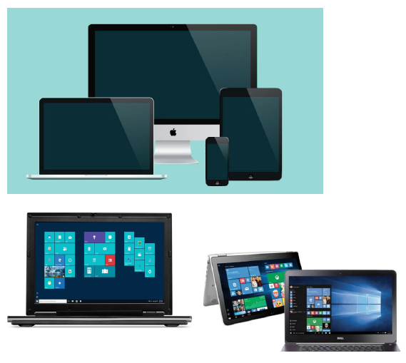
It is true that Bill Gates “PC in every home vision” has benefited the world. But at the same time because windows can be everything to every PC computer company it has a hard time with seamless usability. Most PC’s are too “hackable” and do not integrate well with other PC devices.
Apple’s ecosystem, on the other hand, makes it more usable. Many complain that the lack of compatibility with devices outside of Apple is dumb. Personally, as a personal owner of Apple devices, I cherish the integration of software and hardware and the fact that all my devices work together without a hitch.
For example, if my Apple watch is near my Mac I don’t have to enter a password. I also can copy a sentence on my laptop and paste it on my phone. The tradeoff of not being able to replace parts
is worth it to me because when I buy Apple I am buying performance enhancing devices. I’ll pay a premium if my design work can be done anywhere without programs crashing or battery life only being an hour.
Aesthetic-Usability Effect
Definition: Aesthetic designs are perceived as easier to use than less aesthetic designs.
It is the attractive person effect. If someone is more attractive they should be easier to interact with right? At least you want to believe that. For some reason, the nicer something looks, the longer we want to stick around.
If something looks nicer, we feel like more thought was put into it. That might be true for in the case of thought being put into the aesthetic design, but that doesn’t mean thought was placed into how the user would interact with the product.
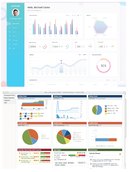
In the above example, both dashboards present data efficiently and clearly. But if I had to choose I would enjoy the top dashboard over the bottom any day. I just feel better watching it. So while giving thought to the UI of a product, I’d also focus on making it look cool too to appeal to the shallower side of our human nature. If I’m going steady with a product I’d like to be attracted to it.
They have the same usability, but I’d still use the top one over the other.
Thank you for reading this, if you found this useful, show some love and click on that clap button. :)
Originally published at CadenD Studios.


